In previous parts of this series I looked at the strategy, and the RFP and hosting. In part three of this restrospective series I explain how the initial design and branding were created and show the evolution of the site up to 2016.
Information Architecture (IA)
One choice that was made early on was how information was structured on the site. This choice persisted through many design iterations, and is extant today.
IA is how information is organised and structured, so it is worth getting right at the start, because the cost and hassle of moving things around later usually means a major redesign is required and it never gets done.
This IA was important from two points of view. We wanted URLs to be human readable (and hackable), extensible, and (at the time) it was believed that good URLs helped search engines find and index site content.
The basic format was:
/station/programme/date
And for programme audio:
/station/programme/audio/audioID/headline
Programme schedules followed at similar format:
/station/schedules/date
All dates are in the format yyyymmdd.
For news it was:
/news/category/storyID/headline
The headline of a story can change over its life, so we allowed the headline part of the URL to also change. Any external links to old URLs were automatically redirected to the current URL.
The redirection was important as there had been a fuss created on social media when someone discovered that you could change the headline portion of the URLs on Stuff, and then share that new link. This resulted in a few howlers, with content being shared with URLs being changed to provide, shall we say, raucous social commentary about the subject of the story.
With the date-based schema for programme and schedule content it was possible to manually change the date, and jump directly to that page.
In designing the overall IA I resisted putting the names of people in the URLs. The hosts of shows do change, perhaps not very often, but over time we’d end up with multiple redirects, which is not a good state to be in from both SEO and speed points of view.
One mistake I did make was using /nr and /cfm for National Radio and Concert FM, as they were called at the time. This was only used for a few years, and was later changed to /national and /concert which are much more likely to be consistent.
The IA translated into the visual design as well, defining pathways to common places.
Visual Design
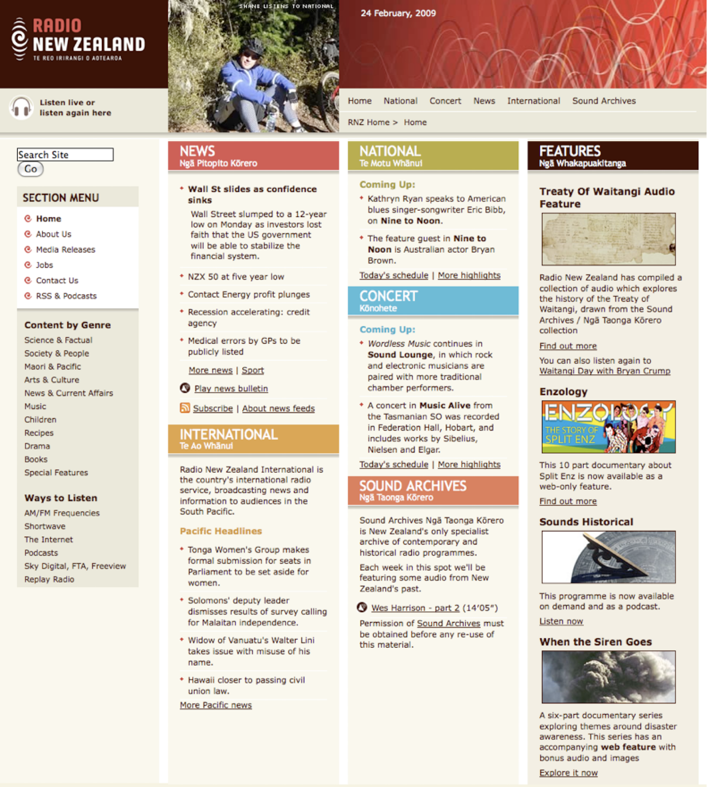
The design of the new site was created by Alto, led by Megan Salole with Sally Coe.
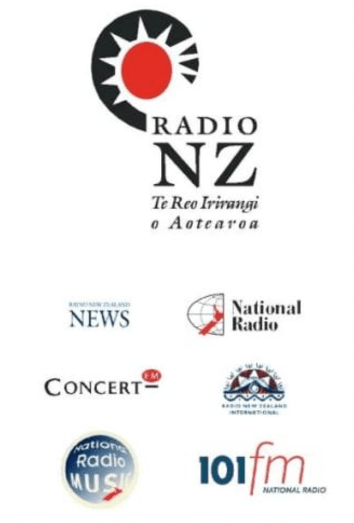
Megan quickly identified that the existing branding (at right), which was designed for physical media such as letterheads, was not going to work on a modern website.
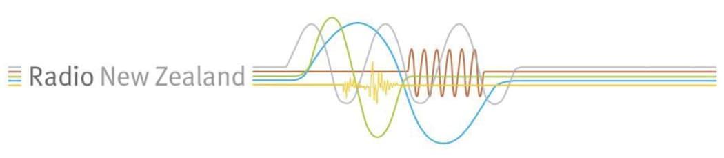
The project’s sponsor Peter Cavanagh agreed that we needed to develop new online branding, and the designers worked with him, our communications manager (the brand owner) and me to come up with something new. The ‘waves’ design replaced the existing collection of brand-marks with a cohesive web-friendly system that represented each brand, and the whole. This was quite a departure at the time, but we had quickly learnt, as many others would, that the web is not print.
This new branding had a different coloured wave for each sub-brand as can be seen below.
The site design process involved the Alto team working with us and coming up with three mood boards containing pictures that represented the visual feel of the brand from their perspective. From that a single board was created, and this led to three designs being created, each showing three or four pages of the site. One of these was chosen, with elements from the other two that we liked being adapted to create a coherent single design.
Built into the design were support for the visitor pathways we knew about from existing data.
To this day, this remains one of the most satisfying design processes I have been through.
The design was sent off to a third-party to create the HTML templates, and this was where our first and only major hiccup occurred. The third-party had a scheduling problem, and was not able to deliver the HTML and CSS on time, missing the deadline for our CMS vendor to implement the work.
We’d paid for their implementer to come to New Zealand to do the work on site, for ease of communication, but they were only able to do some of it, so he spent the rest of the time training me how to complete the work.
Once the work was delivered, I converted all the provided raw templates into a single template for the MySource Matrix system, and got that up and running.
The site was run under test for about three months to iron out publishing bugs and complete some adjustments to the design as the content was being added to the site.
The site launched in October 2005. The previous site had been doing about 30,000 page impressions a month, the new site quickly doubled that, and we were off!
One feature of the site was the quirky listener images at the top of every page. The concept was Alto’s and Megan had a strong view that these were not just plain old headshots, that they had to tell a story. This approach really paid off, with these images giving the site some real personality. They ended up being very popular, with many people sending in their own images for the 2007 redesign of the site.
We already new the most common visitor pathways from previous versions of the site, and these were codified in the IA and design. These pathways were continually refined as the site grew and more content and pages were added.
It is interesting to note that waves design work influenced the major rebranding exercise in 2007, which introduced new logos for Radio NZ and the station sub-brands. That included the ‘koru wave’ motif that is still in use today. Radio waves also featured in the 2007 and 2013 website designs.
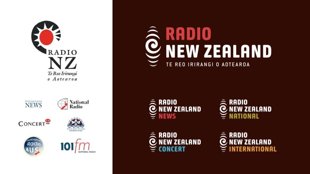
The old and the new. pre- and post-2007 Radio New Zealand branding
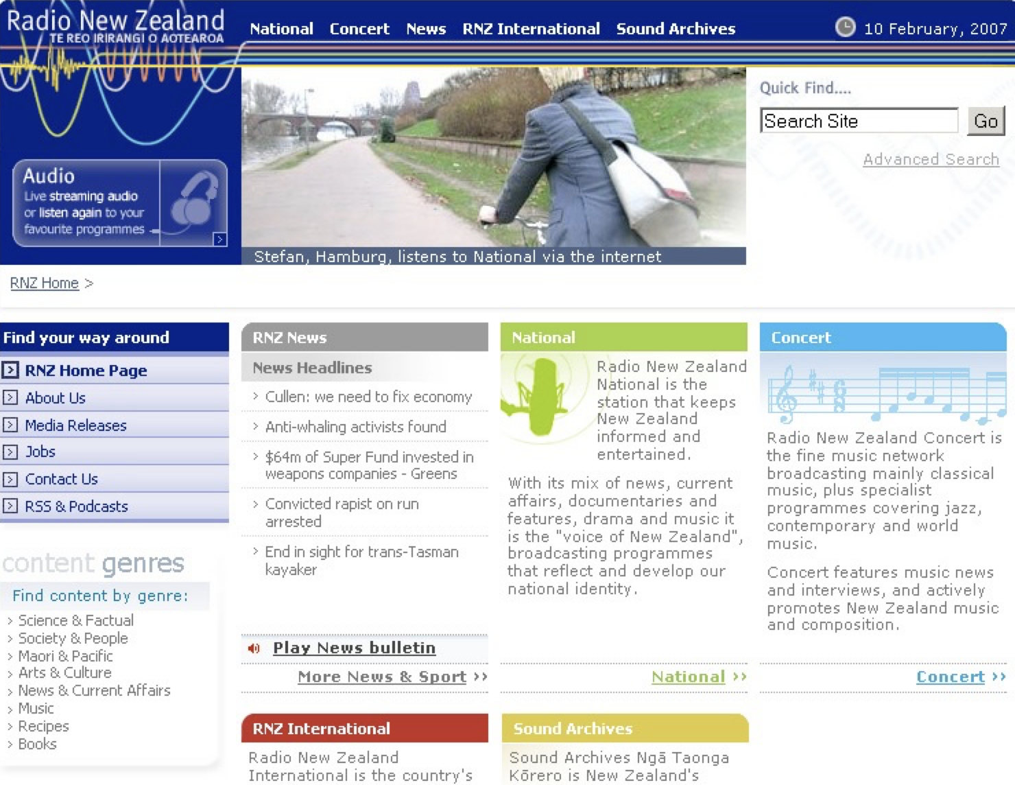
The 2007 branding and design was done by Clemenger BBDO, and site update (below) was rolled out over Christmas that year. The new site was designed by Dianne Fuller, and won the Qantas Media Award in 2007 for Best Website Design, and a design industry award the following year.
Around this time I did some research on personalisation. A number of media sites had tried this on their home pages, including in New Zealand. This mostly revolved around allowing people to rearrange content sections, and to hide ones they did not want to see.
Apart from the amount of engineering required, the user experience on these were horrible, many people struggled to use them, and most sites stopped doing it. One reason was that editors wanted everyone to be exposed to all ‘content potentials’. I haven’t seen a site with this feature in years.
The design was updated again in 2013, this time designed by Susannah ‘Roxy’ Huntington. This was also the year we completed a replacement of the Matrix CMS. Sadly, we did not make the HTML responsive to phones at that time. The techniques for doing this were only a few years old at this point, and in 2014 Ryan French from AbleTech was responsible for retrofitting the site for mobile.
Here is the design we launched in 2013.

As had always been the case, this design was being continually tweaked to support changes and improvements to online story-telling, and when any layout bugs were found.
A constant challenge was to break free of Conway’s Law. This law states that, “Organisations which design systems are constrained to produce designs which are copies of the communication structures of these organisations.”
Up to this point the home page designs had been representative of the internal divisional structure of RNZ. This was not very user-centric because it didn’t focus on what visitors wanted to do.
An extreme example of this problem could be seen on most city council websites 15 years ago. Their home pages were made up of sections, each representing a department of the council. If you wanted to report a water pipe leak, you had to know which department handled that. The naming of departments wasn’t always clear, and you could spent many minutes trying to find what you wanted. As councils started to hire people (or companies) with user experience credentials, they moved to customer-centric task-based home pages. Register my dog. Report a problem. Pay my rates.
If you notice a website with a ‘popular links’ section, chances are there has been a home page turf-war inside the company which precluded making the design useful to visitors, and some poor designer has created these to make it easier for visitors. The RNZ site never had a popular links section.
The departmental approach meant that pathways for common tasks on the RNZ site had to be well signposted, with consistent language and clear design, but some required too many clicks. For example click National, then Programmes, then Nine To Noon. Three clicks, but easy enough to find your way.
Work on the next redesign commenced in early 2016, with a greater focus on news, and moving radio one click deeper in the IA. This is what it looked like on 9 July 2016, shortly after release, and it’s largely unchanged today in August 2023.
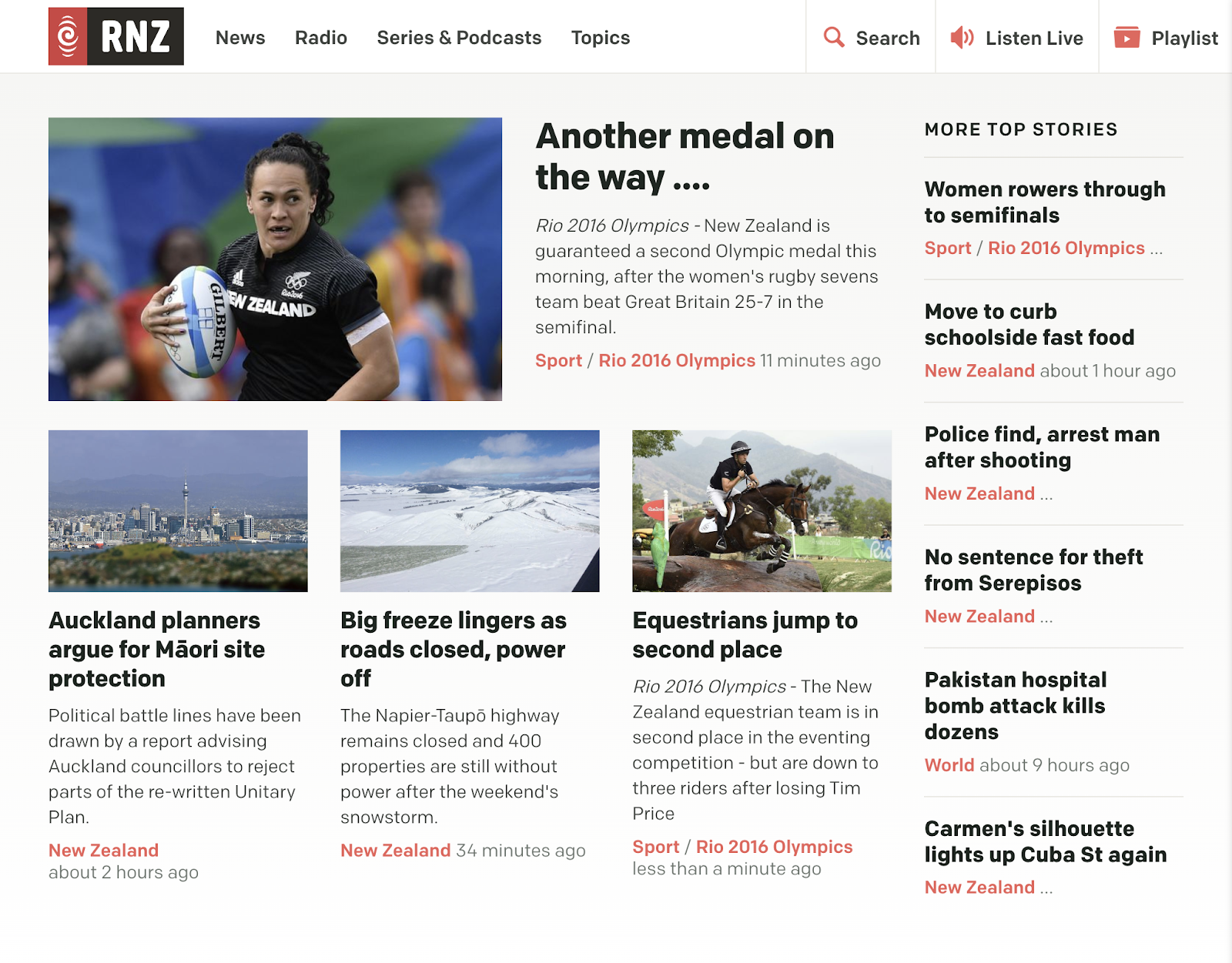
In line with past practice, the underlying HTML and CSS was coded to be future proof, and it appears to have held up pretty well.
Front end technology
I was heavily influenced by the Web Standards Project in the choices made for how the design was initially implemented, and continued to be implemented. This project stood for “standards which ensure simple, affordable access to web technologies for all”. The idea of equitable access is a core principle of public media, and this approach aligned closely with our objectives.
We made a choice to use XHTML 1.0 Strict. The rationale of using this over plain old HTML was that it loaded and rendered faster in modern browsers, and would be compatible with newer browsers which had better support for web standards. Much later we were early adopters of HTML5, for the same reasons.
In 2005, being able to listen wherever and whenever people wanted suggested a cross-platform service—a tall order at that time. The iPhone was still two years away (June 2007), and the consumer market was dominated by Windows PCs.
In 2005 98% of people visiting the site used Windows with a mix of Internet Explorer and Netscape. In 2008 Windows was at 92%. Once smartphones started to take hold there was a massive shift, and in 2014 Windows had 56%, with Android, iOS and Mac making up most of the rest.
In 2016 I recapped:
In June 2012 mobile was 16% of RNZ traffic. In November 2013 it was 29%. In March 2014 it was 23.4% mobile and 10.8% for tablet, making 34.2%. In September 2014 it was 61.8%, 26.3% mobile and 11.8% for tablet. Feb 2015 it was 55.5% desktop, 32.8% mobile and 11% for tablet. At the end of July 2015 it was 53% desktop, 34% mobile, and 12.4% tablet, while in Feb 2016 desktop declined once again, down to 45.6%. Mobile increased to 42.49% mobile, and tablet is down slightly to 11.84%.
The final word this month is that mobile is 54.5%, desktop is 34%, and tablet is stable at 11.46%.
This constant change in the browser market required new choices to be frequently made in a range of areas, including revisions to the HTML and CSS that controlled the design and layout.
On Windows, Internet Explorer was the dominant browser (87%) in 2005, with Firefox at just 9%. A mix of browser-specific CSS and progressive enhancement was used to ensure the site rendering was consistent across these browsers, as well as Safari and Opera.
This got easier over the years as rendering across browsers got more consistent, but you could never let you guard down—manual browser testing was still required.
In order to make the site future-proof, we relied on using open standards, and in particular took quite a hard-line on web standards compliant markup and accessibility features.
This choice was made because it did not cost anything extra to do it, accessibility is a human right, and content presented in that way had the most likelihood of working on future browsers and platforms. It turned out to be the right choice, and one that we stuck to, putting more work into cleaner, more accessible markup with each release.
The focus on accessibility was very much based on the NZ e-government standards. These were proposed in a cabinet memo in 2003 which recommended that standards be mandated for core government websites. RNZ was in the ‘optional but recommended’ group of government entities, and we complied with most of the standards in 2005. Support was further improved, and in 2008 we started testing the site with screen reader technology. Much of what we learnt is codified in the 2016 HTML markup, and this presents an optimised rendering for screen readers that is free of superfluous elements.
I should credit Frances Hopkins for much of our standards work. She was part of the government standards expert’s panel for a while, and also was a beta tester for the e-government standards self-assessment.
Another important choice was to stick with serving plain HTML pages for a combination of speed, easier maintainability, and better overall user experience.
I had planned to add a technology called Turbolinks to the 2016 site to speed up page load times even more, but didn’t quite complete that work before I left RNZ. Turbolinks was replaced by Turbo in 2021, and it is something I would strongly recommend for any website that is mostly serving static HTML pages.
During my time I was always looking ahead for new standards or technology that was trending or over the horizon, and sifting through these for anything useful we could apply or that would give us an edge.
At one point I did investigate switching the site to a single page application (SPA) but this would have introduced a whole cluster of problems. While it initially seemed to provide a more seamless experience, the level of additional engineering (and cost) did not add sufficient extra value. It was also much harder to maintain, much more prone to bugs, and completely reliant on the speed of the APIs needed to drive the site. It is one thing to wait for a page, it is another thing entirely to have a page template which is empty while content is fetched.
I did also briefly consider using React (an SPA framework) for a featured sub-site, and while it was easy to built something at a small scale, the production costs were very much higher than using what we already had. On top of that, we’d have to commit to keeping it maintained, creating a new, second stream of work for the team. With the pressures on costs, and the push for new developments, any sub-site not built in the site’s primary technology would quickly become ‘abandonware’, which broke the principle of making content available ‘forever’. We did publicly release a news ticker app written in React for use in public spaces, and for the RNZ National FreeView video channel.
The problems I’ve outlined were all solvable then, and now, but at a price.
Also, as the size of an SPA grows, the speed you can deliver features tends to slow down, and work stops during the inevitable refactoring that must occur in a growing app. In the end it just wasn’t a great fit, and I’d probably make the same choice again today, or favour a simpler framework like svelte.
Looking at the total cost of ownership of all your options and comparing this with the relative value of each is vital in assessing technology choices. Don’t be swayed by ‘cool’.
Anyway, for a typical media website, almost everything you might want to do with a framework like React can now be done with HTML pages and Javascript. If more interactivity is needed for a particular story, a common approach is to use a modern framework like svelte on just that page.
This approach—targeted enhancement—is being adopted by media and non-media companies alike. It also has a major advantage over mobile connections and when being indexed by search engines.
In the next part of the series I will examine our content management system choices.
* The screenshots in this post come from various internet sources such as the Wayback Machine and the RNZ website. They are copyright RNZ and used here for the purposes of study and critical review.


 Stuff I'M Thinking About
Leave a comment