
The identification of the media object pattern by Nicole Sullivan was a significant event in the development of CSS design patterns. It started a movement, but I struggled with applying it in my day-job for a number of reasons.
The first was that putting the headline after the image in the markup felt semantically wrong to me.
The second, was that site I worked on at the time, www.rnz.co.nz, was filled with ‘real’ media objects – audio, video, and images. From a naming point of view it just did not feel right overloading the term in this way. And naming is, after all, one of the hardest problems in computer science.
Or perhaps I just had too much time on my hands.
The so-named media object is everywhere on the internet, as the examples in this gallery shows:
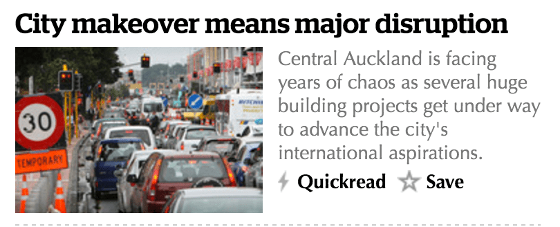

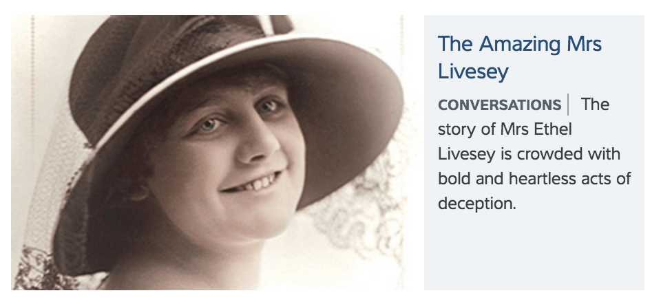
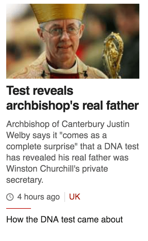
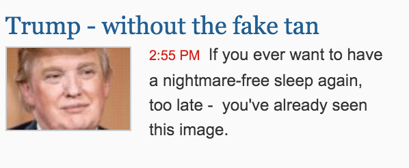
The styling is different, but the pattern is the same.
The visual object will often have additional information after the summary, specific to the underlying object’s data such as a timestamp or tags.
I spent a couple of hours with a thesaurus before deciding on the name. Summary was no good as that described some of the object’s content. Digest seemed to be the closest being, “a compilation or summary of material or information.”
My solution at the time was the digest object. The basic object had (in this order):
- A headline
- An image
- Summary text
I could also included tags and a marker if there was audio or video in the story. The CSS coding for the original was a little complicated, but was designed to be accessible and work in range of scenarios and contexts. The aim was to use the same object throughout the site, and restyle it CSS based on the context.
I recently (in 2023) needed this pattern for a personal project, so I’ve recoded it from scratch using modern CSS, fixing some of the issues that were hard to solve last time.
The new solution uses CSS Grid, which is widely supported, and allows for significantly cleaner markup and much less CSS. And this time, the image goes at the end.
See the Pen Untitled by Richard Hulse (@rhulse) on CodePen.
https://cpwebassets.codepen.io/assets/embed/ei.jsThe prefix ‘c-‘ is for component and o- is for object. This follows the style proposed in the ITCSS framework, and which I am using for my project. I am not using Tailwind or some other CSS framework because the project has some very special requirements in regard to payload size.
The link overlay concept is something I cribbed from the BBC website (they still use it) and which is designed as a semantic method to make a whole block clickable. I never liked the idea of wrapping the whole block in a link, which is a common solution to this problem, and clearly someone at the BBC didn’t like it either!
In regard to accessibility, the image and the overlay link are hidden from screen readers. In the case of the image, these don’t add any value to someone visiting the page with a screen reader. The same goes for the second (overlay) link in the block. Hiding both of these from screen readers reduces the ‘noise’ caused by items that are irrelevant in the context of getting a summary of new stories. We tested this when I was at RNZ, and the screen reader reader community loved this feature, and given that the CMS generates the markup automatically why wouldn’t you do it?
Because this uses CSS grid it is easy to add new elements and redefine the grid based on the context in which it appears or on screen size.
As usual, feedback and comments welcome.


 Stuff I'M Thinking About
Leave a comment