
The old New Zealand Herald site was getting a bit tired, having had its last design update in 2012. It didn’t support mobile well, and the old CMS was, I suspect, becoming quite inflexible. That constraint was probably the reason behind their insights section being hosted on a different technology stack (Ruby on Rails).
But despite that recent innovation, I suspect that frustration was growing as other local news organisation’s sites were updated (sometimes many times), and were also joined by the shiny websites of new entrants to the market.
Generally speaking, a redesign will be undertaken to support a new editorial direction and improve the user experience, while also allowing for on-going improvements. It can also be an opportunity to review existing business processes and any supporting technology.
There are many factors to consider during the redesign process, and a large website with lots of existing content has its own special challenges. I know this because I’ve done it myself, half-a-dozen times. Some of the problems include migrating old content to a new system without breaking it (and the URLs), reprocessing images and video formats, and implementing changes in workflows and tools. It’s not easy.
There are also trade-offs to consider along the way. The NZ Herald team will have had their own problems to solve, and the solutions they chose reflect the information they had at the time. I don’t have that information, and it is easy to criticise, not knowing what the challenges were. People in glass houses, and all that…
On top of this, change is difficult for regular visitors, and it is very easy to say ‘this’ is bad, or ‘that’ is bad simply because it is different.
So keeping those thoughts in mind, on with the review.
The Site
First up, good on the team at the NZ Herald for embracing adaptive website design. The site has fixed layouts at each width breakpoint, becoming largely one column for phones when the browser window is sufficiently narrow. For news sites I prefer this approach to fully responsive, because there is better control over images sizing and the flow of text. This is more predictable for editors who have to write headlines and summaries within certain word limits.
The widest rendering of the site is at 1270px, with major breakpoints at 970px and 660px. There are about a dozen intermediate tweaks to fine tune parts of the layout in between those sizes.
Headlines on the site are set in Stag Book, while body text and summaries are Source Sans Pro Light. The proportions between headings and body feel right, as does the line spacing. My only gripe is that the font size feels a touch too small everywhere, and especially on mobile. The Source Sans Light can look too thin at small weights, especially on retina screens, and readers with less than perfect eyesight will struggle with this. I don’t mind the grey secondary text in headline blocks on the home page, although I have seen many complaints about this on Twitter. I suspect the combination of typeface and size is the problem here.
One the image side, I can see from the code that hi-res images are being lazily loaded if the browser supports them. This saves bandwidth by only loading higher quality images when they are needed, such as for retina-grade screens. The images from high quality sources looked really sharp on the retina screens I used for testing. At some screen widths the images are resized from their native size, and they look fine at all these intermediate points. Nice work.
Images with less-than-ideal provenance look much worse in comparison, but every news site has the same problem, and it doesn’t detract from the overall look. In fact, as any good photojournalist knows, technical shortcomings in a image can sometimes enhance its impact.
Home
The home page, with its large hero image for the lead story, two secondary stories underneath, and a sidebar of text-only headlines did immediately make me think of RNZ’s home page. That’s not a surprise though – variations on this layout are finding favour in many places because they give editors a range of visual weights (size, images, text-only) to work with.
It also allows more story shuffling between the top spots – that is a trick where editors can move (and re-headline/re-image) stories as they move up (and down) the priority order without it being so obvious to readers. That makes it look like there is new content, when there isn’t, keeping the site looking fresher. Perfect for slow news days.
Below the top section the rest of the page has been extended to allow more options for editors to highlight content to readers. The top stories from each of the main sections on the site are replicated in zones down the home page, these being interspersed with other content such as advertising, a selection of videos, and opinion. The design patterns used in these are all fairly standard stuff.
Overall, the home page has been configured as a gateway, or portal page. I suspect this is because the home page has been a big driver of traffic to stories in the past. But with the rise of social media, any page can be the entry point to the site, and the focus needs to shift from funneling people into stories from home, to promoting great user journeys regardless of where the visitor enters the site. This portal-like approach does make the page feel a bit busy, and unfocussed.
As a side note, when I was at RNZ less then 15% of visitors ever went to (or via) the home page during a visit, this having risen slightly after the amount of content on home was increased in 2015. Some overseas sites, such as the New York Times, have seen massive drops in home page traffic due to social media referrals going direct to story pages, with some writers even suggesting that the home page is dead.
Here, the editorial selection on the home page is a compromise between stories that will generate clicks, and therefore advertising dollars, and ‘serious content’. While ‘most people’ complain about click-bait stories – yes, you know the ones – statistics suggest that ‘most people’ do, in fact, click on these stories and read them. I know that times are tough, there are bills to pay, and clicks on those stories (by ‘other people’, of course) pays for the stuff that I really want to read.
On this page, and others, I don’t like the ‘Quick Read’ and ‘2 minutes to read’ markers. They clutter up the layout on mobile, and seem to be a waste of space on desktop. If I’m short on reading time, I just stop reading and move on, and research suggests that this behaviour is pretty widespread.
The lack of summary text for the stories in many places is annoying, particularly when the abbreviated headline style makes it hard to determine what the story is actually about. A clever pun, alliteration or in-joke doesn’t cut it; is the payoff worth the click? For this reason, headlines should be longer when there is no summary to draw interest.
Sections
Looking at New Zealand news section, the page is naturally a lot more focussed. Like Home, this is also a transitional page, with links to stories of interest, and the time spent by most visitors here is probably quite short. People want to find an interesting story and click through, and these pages serves this need very well.
The heading on the home page for this section (and others) has an underline but it is not clickable. Annoying.
Stories
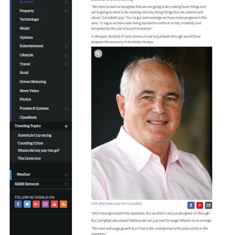
A story page starts with the headline, timestamp and time to read. The hero image (as they are often called) is a standard 16×9 ratio is followed by a row of social media buttons. There is optionally an author credit, and the main story starts after a dividing bar.
This is a fairly common layout pattern, used by pretty much everyone from the Washington Post, New York Times, to the BBC. Personally, I prefer getting a stand-first (introductory text) before the image, the approach adopted by RNZ, Der Spiegel, and the CBC. To me, that approach feels like you can get into reading more quickly.
In the case of the NZ Herald, the design of the top section of the story page feels like a bolt-on, and does not allow the eye to flow easily down into the body of the story. It is like hitting visual speed bumps.
Once into the body of the story everything seems to sit nicely, although on short stories the long sidebar can result in much whitespace underneath. This is a problem on many websites, and one approach to avoiding the problem is moving some sidebar content under the story in those scenarios. It’s a small thing though.
For image the preference seems to be full width of the body, although this does not work well when there is a large portrait in the page like in this story.
On mobile the experience is more fluid, notwithstanding the font size mentioned above. The most annoying thing here, though, is the constant fight between the social buttons and the home/hamburger menu. In some cases you can get both, as shown below.

Social buttons don’t need to be anchored on mobile because those who want to share, and are most likely to share, will be using a native app. The social sharing buttons take you to a website, and honestly, how many people do you know who are logged into a social media website on their phone? Leaving the buttons in the standard page position is perfectly fine for people who are not using social apps, as they are more likely to be on desktop where they’ll be logged in to social. (At least, they are in data sets I have seen.)
The layout of stories is better on mobile as there is less to scroll past to get to the story. I tend to scroll quickly past the image, so I can start reading, unless the image is a stand-out.
One final point. Video autoplay. Just don’t. It’s bad, and I defer to the Nielsen Norman Group on this point:
When users arrive at a webpage, they don’t appreciate being surprised by video or audio content that begins playing without their consent. Video, and the accompanying audio, can confuse or distract users, and can interfere with their consumption of content on the page.
Those users who do not want to watch the video must devote cognitive resources and extra effort to figure out how to turn the audio off or pause the video, rather than focusing on their goals and information needs.
If there is substantial contrary research, please provide links in the comments.
User Experience
The overall look of the pages is nice, and I can see a lot of effort has been put into making things sit on the page, and to create a cohesive look across the entire site. It is a sterling effort.
However, there was something niggling me, and it took a week of use to finally pin it down. On the home page, the combination of the densely packed design, the headline’s dark grey colour, dark grey summary text (with slight green/blue tinge), and the light grey metadata text, creates a lack of visual contrast. This in turns causes the eye to float around looking for the something to stop on.
The other problem is inconsistent vertical rhythm. Take the top headline block and the latest news block below it, for example.

The vertical whitespace between elements on the page is also not quite right, so the page does not flow so well when scrolled, and there is nothing to catch the eye.
Well almost nothing. In some cases the size of the advertisements exacerbate the problem outlined above. In the example below, two nearly adjacent sections are running a large banner ad. The image and text in these completely overpowers the adjacent news content. You don’t want to look, but it’s hard not to.


Another problem is that links are not a consistent colour, and there is no hover state on desktop to help with discovery. They are black on headlines, blue in body copy, and different colours on category names. Many of these are too subtle for me to differentiate – like 8.5% of the population, I am colour blind. On desktop you can hover over the text to see if it is a link – the cursor changes – but no such facility exists on touch devices. If people need help with link discovery, that’s a bad user experience.
And before I get emails on the subject, yes, RNZ does also have black link text for headlines. In that case (I executed the solution) the problem of link finding was mitigated using a faux-link overlay on the entire block for each story. This is the same pattern that the BBC use, and it is semantically correct, screen-reader friendly, and behaves correctly on all devices. It is a tolerable alternative to underlining links, underlines still having the lowest measured cognitive load, and therefore promoting the best user experience. With modern browsers the underline can be styled, but this is another discussion.
The combination of all these factors just made me feel a bit lost as I scrolled and scanned pages looking for something to read. I’ve seen comments on Twitter and Facebook that hint at a similar experience, but I couldn’t say how widespread it is.
Analytics may tell another story, of course, but I suspect it is too early to say, and extrapolating this particular problem from data alone is difficult; there will be hints there, and this could be confirmed with observations of real users. I’m happy to be corrected in the comments.
The Side Menu
I don’t run my browser wide enough to see the left side menu all the time, and to be honest I would narrow the browser to avoid it if I did. With the contrast problem identified above, it’s just too distracting.
The top section is very cluttered, and being white text on black, it just dominates the page. On mobile, however, the contrary is the case. It looks good and works very well.
Tuning this type of menu for desktop/mobile use is tricky, and I have been inclined in the past to have completely different menus, appropriately hidden using CSS, so that the experience (and options) for each use-case can be optimised.
Insights Section
The Insights section of the site currently uses Ruby on Rails, but newcomer Chris Knox has rewritten it to use static web pages (i.e. not using a dynamic content management system). The pages will be updated using a static site generator that direct publishes via a git pull request. This new version will be live in the next few weeks, and there are plans to open source the code.
The static site approach is one that is gaining favour, partly to remove the overhead of having to assemble the pages for each request, even when nothing has changed. This allows for big speed improvements, particularly for pages that were very database-centric.
Smashing magazine adopted this exact approach when rebuilding their site, resulting in 10x performance improvement. I’d imagine that Insights will benefit even more, given the data heavy nature of pages.
In terms of design and content layout, Insights has always led the main NZ Herald site, mostly because the different technology stack would have allowed them to do things differently.
My only criticism of the section is that it is not part of the main site (i.e. nzherald.co.nz/insights) and that the content is often – in my view – not well integrated into stories. Some stories just end with only a link to the Insights page at the end, and an invitation to explore more.
I’d like to see a more integrated approach where aspects of the interactive are featured inside the body of the story, and where readers are given guidance on how to explore the data. Anchoring the data analysis inside the narrative in this way will provide more visible entry points into the interactive component, and will give explorers more context as they start their journey.
An example of this is the recent analysis of crime statistics. A story about regional differences could have linked into the interactive starting with coarse regional differences highlighted. Another story about socio-economic differences could have entered via that axis. I hope that with the technology changes I outline below, tighter integration will be possible in the future.
That is a relatively minor gripe about good and important work that deserves higher visibility.
Search
Search is hard, and I base this on having written my own search engine once. With modern tools like Lucene, the technology behind Solr and Elastic Search, the complexity shifts from building to indexing, and weighting fields and tags, creating facets, and so on. Everyone is tough on search, because they use Google as their benchmark. Sorry folks, that’s not fair; we can’t all be that good.
Reviewing this search, I tried a number of terms:
- John Key
- fish
- rubber duck
- TPP
All but ‘rubber duck’ gave me good results; Ernie would be upset, rubber duck was a 500 error. The searches for fish and TPP had no images, while ‘John Key’ did. There, the image layout does need attention as it’s butted right up to the result text.
I tried a bunch of other random terms and got a mix of 500 errors and pages with and without images.
The faceting of NZ Herald, Galleries, and Videos, and section faceting below this are a great idea, but the links do not always work. Browsing around I kept getting 500 errors, and the faceting links would suddenly stop working. I also got some not found errors when clicking through from search results.
From what I can see, I’d say these are just teething problems. Perhaps a simpler search could be offered why these are addressed.
Nice 404 page, by the way:

Technology & Performance
The New Zealand Herald have signed a licensing agreement with the Washington Post to use the Post’s ARC platform. ARC is a suite of tools designed to support improved business processes so that staff can focus on creating value instead of haggling with publishing tools. ARC is modular, and looks to the future with its modular design and focussed best-of-breed tools, optimised for common media publishing tasks. These can be assembled to support virtually any publishing process.
ARC replaces (what I believe was) the old ColdFusion-based CMS. This must have become very difficult to maintain, and these days it’s not a platform anyone would want to innovate on.
There are clearly advantages in using a system built be a company trying to solve similar problems, and my guess is that the Herald will also leverage off the WaPo’s business process improvement efforts.
I am not sure if the new tools are in use yet, but in terms of performance, the speed index of the new site (via webpagetest.org) is ~7,100. This isn’t too bad, and is about the same as Stuff (~7,400), and double RNZ (~3,300). The Washington Post sits at ~4800. As an aside, the RNZ figure is double what it was last year, which goes to show that once fast, not always fast; one needs to stay on top of these things. But I digress.
The layout is adaptive, rather than responsive, for these reasons, and on the code side this appears to have been executed using the ubiquitous Bootstrap framework.
The source code of the pages is minified, including the HTML, and gzip is being used to serve the assets. Important details, for those in the know.
The website’s headers report that the nginx webserver (1.13) is in use, and it appears that they’ve dropped the use of the varnish web cache which was evident on the old site. Varnish would still be an advantage, even with this new site, using asynchronous fetch and a small amount of grace would provide a big improvement to perceived performance. Web performance nerds will be able to parse that last sentence effortlessly. My sincerest apologies to other readers.
The site is using schema.org metadata on their individual stories, which is good for SEO, although the item type for stories should probably be changed to ‘NewsArticle’ from ‘ItemList’. Given the new CMS this would also be a good chance to add schema.org metadata onto images as well.
There is a sitemap, which is used by search engines for indexing the site. Only the latest stories appear to be available there, and while Google will eventually crawl the whole site, a complete sitemap augmented with a seperate dynamic news sitemap would vastly improve the indexing process.
Rough Edges
The close button on the left menu overlays some text. And did someone say ‘we can balance up that area by putting the web address in too’? Yep, the same one as in the address bar.

Summary text under the hero image in stories is a little close to the edge of the screen, making it hard to read.

Also, sometimes images do not load correctly.

I am sure someone is looking into these, or will be. 😉
At times there are duplicate stories in some sections on the home page, and in the sections themselves.
These sections are probably auto-populated, and I know from experience how difficult it is writing de-duplication code for such cases. I am sure that’ll be fixed too.
In the interests of humility, I won’t share how many small issues the RNZ website had when it was re-launched last year, but there were more than this. 😉
Summary
As I said at the start, redesigns are difficult, and there are many trade-offs to consider. In light of that, and despite some of the negative comments in this review, this is an amazing effort. The Herald team should rightly feel proud of themselves – they have launched a new website, migrated a ton of content, and adopted a new world-class technology stack. I am quite envious.
I am going to predict that visitor traffic has improved since the redesign. A new design generates buzz, and people come and check it out. When the buzz dies down, and the smoke clears, reality will undoubtedly set in. Then, look deeper; use the force.
Given the tools that the NZ Herald have adopted, they are now in a very strong position to respond more quickly to the changing market, and to be more agile in response to analytics. I look forward to seeing how the site evolves over the next few months.
The comments are open for feedback, corrections, and observations.
* An earlier version of the story stated that the last design update was in 2002. Updates were in 2006 and 2012.

 Stuff I'M Thinking About
Leave a comment